Class project
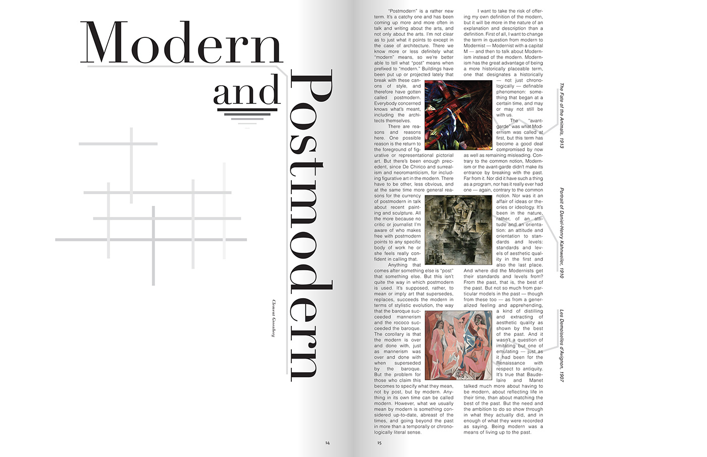
This design is fairly modest, in order to avoid being too distracting to the reader as they make their way through the article. Lots of negative space and the use of line to connect elements helps to bring together the page, showing a modern style of design to present the information.
Back to portfolio